At a time when my future felt uncertain, I was confident that every one of the “892 interlocking pieces” would eventually find its place and manifest its function.
At a time when my future felt uncertain, I was confident that every one of the “892 interlocking pieces” would eventually find its place and manifest its function.
I contributed several edits to the Deep Learning Tutorials presented by the University of Montreal LISA Lab.
My martial arts journey probably started in 1977 at age nine.
Who among us has conquered anger? Certainly not I. It is remarkable, then, that I never saw or heard her express anger in any way.
What is poison? What is fear? What is envy? What is anger? What is hatred?
Discomfort comes from swallowing our pride and submitting to your teenager’s new-found power and knowledge. Conclusion #4: Check your ego at the door.
Conclusion #3: Pick your battles. This means saving your energy to address and correct only the most consequential behaviors.
Conclusion #2: It is important to be crystal clear between both parents and children that the parent-child relationship is not identical with friendship.
Your teenager remains unexpectedly dependent on you to meet various needs in various situations, yet unexpectedly exerts his or her independence in other situations. Conclusion #1: Set your expectations in accordance with this reality.
Humility is not thinking less of yourself, it’s thinking of yourself less.
Neal DeGrasse Tyson, John Cleese, and Francis Crick
I heard this song while growing up, and it remained in my memory simply because it mentions my name. The poem seems to celebrate unwavering focus in joyful work, illustrated by the honeybee.
Pain is like the barking of a dog. A healthy body uses pain to warn of danger or threat. If we acknowledge pain as a natural response and address it in a conscious way, it should naturally dissipate without causing unnecessary suffering.
At times, reasoning tells you that something is impossible, and experience reinforces this conclusion.
Meditation is concentrating the front of the mind with a mundane task so the rest of the mind can find peace.
In order not to stray into delusion, we must ask ourselves whether our faith is truly a belief in an unlikely outcome, or a rejection of what we know to be true and possible
Is “faith” not the best word for following an intuition, when confronted by evidence to the contrary?
For decades, I have eschewed faith…Therefore, it surprised and puzzled me…to find that…I possess and profess a quality best described as faith.
It is incorrect to believe that people “lose their religion” with education.
We asked a friend about her first child, a 1-year-old daughter.
आकाशात् पतितं तोयं यथा गच्छति सागरम्
I took a course on great books in college, and the question of what constitutes a “great book” was visited throughout the course. In my recent study of the Bhagavad Gita, the same question has come to mind.
I’ve always maintained that my political views are rooted in the works of Ayn Rand…These roots have been shaken by the financial crisis of 2008 and the current Presidential election.
I recently read a quote attributed to Yoshida Kotaro Sensei: “There is no failure, only feedback.” On the same day, I read “Must fail to suc
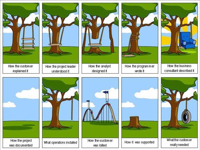
In recent days, I was asked for a requirements document under two circumstances. In one case, a client asked for a requirements document.