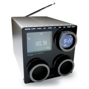
Design Critique of the Porsche Design Radio
The SkyMall catalog on my flight last week had the Porsche Design Radio on its cover.

This one is quite pretty, but seems to depart from the Bauhaus principle, “Form follows function.”
I particularly like the look of the round knobs, but would be disappointed if you can’t twist them to do something interesting and relevant. Can anyone validate this?
In the generally-accepted definition of a clock radio, it wakes you up in the morning, but lets you snooze–sleep a few minutes past your set alarm time–before the alarm goes off again. The manufacturer really decides how often this cycle is allowed to repeat, but in my experience, one hour is a minimum. The cycle is meant to repeat until the snoozer (not to be confused with the snooter) gains full consciousness and/or readiness to face the day, and turns the alarm off completely.
This typically requires that the snooze button be large, and/or textured and/or lighted so that it is easily accessible in the dark to the barely-conscious snoozer. It also requires that other controls, particularly the one that turns the alarm off completely, be differentiated from the snooze button in size, location, or type to prevent accidental activation by the barely-conscious snoozer, lest his snoozing plans be foiled.
It appears that the controls for this clock radio are tiny metal buttons arranged in a neat row across the top front. Hence, it fails to meet basic requirements. In my opinion the aesthetics of this product fail to stack up against the annoyance of oversleeping.